CRCL: Crisis Response. Community Led.
Cause+Affect partnered with CMHA BC to rename, reposition, and rebrand the innovative health initiative formerly known as PACT (Peer Assisted Care Teams). Now known as CRCL (Crisis Response. Community Led.) The new identity reflects a transformative shift in how communities across British Columbia respond to mental health crises. Designed to centre trust, safety, and peer-led support, CRCL embodies the care and community leadership that define this groundbreaking approach.

Circle of care
The CRCL mark was designed to signal its role as a crisis response service. At its core is a bold, eye-catching symbol that subtly nods to the universal medical cross, with one arm replaced by a circle. This distinctive shape not only reinforces the name CRCL, but also sets the brand apart with a unique and memorable identity.
The highlighted circle is more than a design choice; it’s a symbol of community, rendered in a signature colour that connects CRCL to those it serves. As the organization works toward its vision of becoming the “4th response” in emergency services, the circle’s thoughtful placement underscores this ambition, positioning CRCL as a vital complement to police, fire, and ambulance services.

Community Customization
Each CRCL team operates within a distinct community, each with its own lived experiences, cultural context, and local needs. To honour this diversity, every community is represented with a unique colour, an intentional design decision that reinforces both individuality and connection.
This system reflects CRCL’s community-led ethos: rooted in place, responsive to people, and united by a shared commitment to transforming crisis response in BC.

A more compassionate society starts with a circle of support.


Subtle and Professional
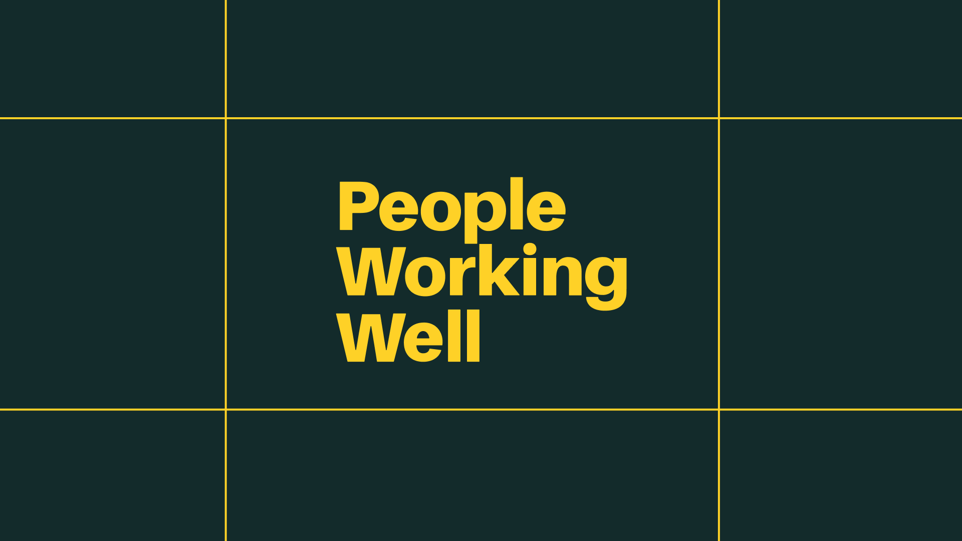
Mental Health services rely on respect and dignity. A brand must appear professional without creating unnecessary awareness.


A flexible design system
The CRCL brand was designed to be cohesive and easy to use across communities with varying capacities. Each branch has access to editable logo marks in their unique colour, reinforcing local identity within a shared system.
A centralized Canva hub provides simple, customizable templates, ensuring every team, regardless of design experience, can confidently represent the brand in their community.

Brand Consistency
A detailed brand guidelines document ensures consistency, clarity, and confidence across all touchpoints. For a multi-community initiative like CRCL, it provides essential direction on how to use the brand correctly, helping diverse teams maintain a unified identity while adapting materials to local needs.