
For over 65 years the Housing Foundation of British Columbia (HFBC) was one of the province’s largest non-profit housing societies.
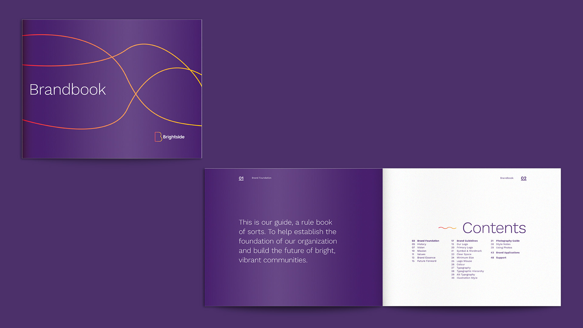
Having served senior citizens in Vancouver for years, HFBC managed 27 buildings and 945 units with assets totaling nearly $250 million. Faced with the current housing market crisis, the organization reconsidered its future. We guided HFBC through a rebrand, transforming it into Brightside—a socially-driven developer prioritizing existing residents and contributing to the housing infrastructure required for our future.


Housing is a Right
The rebrand stemmed from Brightside's dedication to housing as a fundamental human right, recognizing that addressing any other human challenge is contingent upon having proper shelter.

The Brightside logo embodies boldness and confidence while maintaining a warm, friendly, and inviting feel—capturing the essence of the brand. The vibrant and energetic color palette reflects the communities Brightside represents.


